branding /
graphic design
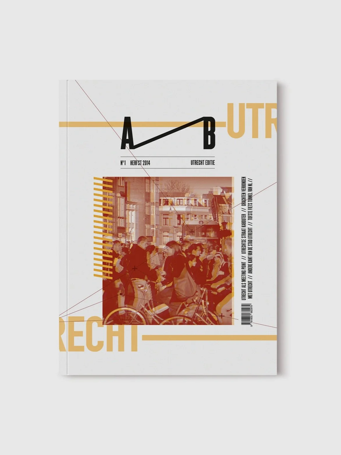
Connections are everywhere and in everything and that's exactly what this project is all about. I decided to create a typographic magazine platform for students to get more knowledge about the different kinds of cities in the Netherlands, so that they would be more interested in the cultures of each city and the differences that would eventually lead to more inspiration in their creative process.
As already mentioned the concept behind this project is Connection. The idea of this concept was created during several visits to the city of Utrecht. The city is located in the middle of the country and serves as a huge connection point for travellers. During my time there I discovered that the city is a capital of connections in culture, art, people and even design. So I wanted to inform people about what connects us with the cities and what type of connections there are.
In my designs is used a lot of minimal typographic elements which are heavy based on the conditional designs made by Jonathan Puckey and Luna Maurer. The lines represent the connections with the dots and crosses which are pointing out places. A–B stands for getting somewhere from A to B like a journey or a progression. The color schemes are influenced on the certain type of season the magazine is released in, bright colors in the warmer seasons and less bright colors in the colder seasons.
Client
–
Year
2014
Tools
Illustrator
InDesign
Info
This is purely fictional and is not used for commercial purposes.


